

High-impact graphics are visual assets specifically crafted to capture attention immediately and communicate a brand’s message with clarity and force. The term “high-impact” is the popular marketing shorthand for what designers call high-performance visual communication, a discipline built on measurable outcomes rather than aesthetic preference alone. Visual-first campaigns increase revenue by 80% for top performers and deliver 3x higher ROI than text-only approaches. That number tells you one thing clearly: the quality of your visuals is not a secondary concern. For business owners and marketing professionals, understanding what makes graphics truly impactful is the difference between advertising that converts and advertising that disappears.
What is high-impact graphics, and what makes them work?
High-impact graphics are defined by their ability to stop a viewer, communicate a message, and drive a response, all within seconds. They are not simply “good-looking” designs. They are built on specific principles that align with how the human brain processes visual information.

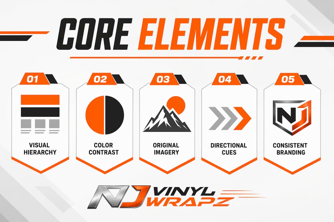
Visual hierarchy
Visual hierarchy is the arrangement of design elements so the viewer’s eye moves in a deliberate sequence. A strong hierarchy places the most critical information, whether a brand name, a price, or a call to action, where the eye naturally lands first. Without hierarchy, a viewer scans randomly and retains nothing.
Color contrast and palette selection
High-contrast visuals improve message readability and effectiveness by 47%. That improvement comes from the brain’s ability to distinguish elements faster when contrast is strong. Warm, earthy, and vibrant saturated color palettes also correlate strongly with higher return on ad spend, while washed-out colors consistently underperform across campaign types.
Original imagery over stock photos
Using stock photos decreases visual effectiveness by 23%. Audiences recognize generic imagery instantly, and it signals inauthenticity. Original photography or custom illustration connects a brand to a real identity rather than a shared visual library.
Directional cues and composition
Directional visual cues, such as gaze direction or a pointing gesture, guide viewer attention toward the most important element on the page. This is not a stylistic choice. It is a behavioral one. Placing visuals and calls to action in optimal viewing areas results in 40–60% higher click-through rates.
Pro Tip: Test your design by squinting at it. If the most important element does not stand out immediately, your hierarchy needs work before anything else.
How do high-impact graphics improve branding and advertising results?
The evidence connecting visual quality to business outcomes is direct and consistent. Creative execution accounts for about 70% of a campaign’s effectiveness, outweighing targeting precision and budget size. This means a well-funded campaign with weak visuals will underperform a modest campaign with strong ones.
Websites with high-quality visuals show 102% better conversion rates compared to those relying on low-quality or minimal imagery. Video content pushes this further, with the ability to boost ad conversion rates by 86%. These are not marginal gains. They represent the difference between a campaign that pays for itself and one that drains budget.
Brand recognition is the longer-term payoff. Consistent, well-executed visuals build memory structures in the audience’s mind. Each time a viewer encounters your brand’s color palette, typography, or image style, recognition deepens. Over time, that recognition translates into trust, and trust translates into purchase decisions.
“Effective visuals anticipate human behavior to guide attention efficiently. Creative execution is the single largest driver of campaign performance, more powerful than media placement or audience targeting alone.”
The implication for marketing professionals is direct. Investing in visual quality is not a creative indulgence. It is the highest-leverage decision in your campaign budget.
How do you build and maintain a consistent high-impact visual brand system?
A visual brand system is the documented set of rules that governs how your brand looks across every channel and format. It covers logo usage, color codes, typography, image style, spacing, and size minimums. Without this system, individual designers and vendors make independent decisions, and your brand fragments.
Companies with consistent visual branding generate up to 23% more revenue than brands that apply their identity inconsistently. Consistency is not just an aesthetic standard. It is a revenue driver.
Building a functional visual brand system requires four steps:
- Document your core elements. Define your primary and secondary color palette with exact hex codes, your approved typefaces with size hierarchies, and your logo with clear rules for minimum size and spacing.
- Create usage rules with counterexamples. A brand guide that only shows correct usage is incomplete. Including counterexamples in brand guidelines, showing what poor design looks like, is the most effective way to prevent misapplication by vendors, agencies, or internal teams.
- Set image style standards. Define the mood, lighting, subject matter, and composition style for all photography and illustration. This prevents a mix of clinical stock photos and warm lifestyle images appearing side by side.
- Apply the system across every touchpoint. Your brand system must cover digital ads, print materials, vehicle graphics, signage, and social media. Gaps in any channel create inconsistency that erodes trust.
| Element | Standard to document |
|---|---|
| Color palette | Hex, RGB, and CMYK codes for all approved colors |
| Typography | Font names, weights, and size hierarchy for headings and body |
| Logo usage | Minimum size, clear space, approved backgrounds |
| Image style | Mood, lighting, subject, and composition guidelines |
| CTA design | Button style, copy tone, and placement rules |
Pro Tip: Assign one person or team as the brand system owner. Without a single point of accountability, brand guidelines become a document nobody enforces.
Documented usage rules and systems are what prevent brand fragmentation at scale. A logo file alone is not a brand system.
What are real-world examples of high-impact graphics in business?
High-impact visual design appears across every medium where businesses compete for attention. The principles stay consistent. The execution adapts to the format.
- Digital advertising. Multi-panel and grid ad layouts outperform single product hero shots by up to 272% ROAS in ecommerce campaigns. Showing multiple product angles or use cases in one ad unit gives viewers more reasons to engage without requiring additional clicks.
- Vehicle wraps. A commercial vehicle wrap turns a fleet truck or van into a moving billboard. When the design applies consistent brand colors, clear typography, and a single contact call to action, it generates impressions across every route the vehicle travels. Njvinylwrapz specializes in this format, producing fleet vehicle graphics that maintain brand integrity across an entire fleet.
- Print and signage. High-impact print graphics rely on legibility at distance. This means large, high-contrast type, minimal copy, and a single visual focal point. Designs optimized for legibility at small sizes also transfer well to large-format print.
- Window and floor graphics. Retail environments use window and floor graphics to direct foot traffic and reinforce brand identity at the point of sale. These formats reward bold color choices and simple, direct messaging.
| Format | Key design priority | Common mistake to avoid |
|---|---|---|
| Digital ads | Multi-panel layout, strong CTA | Overloading with text and multiple messages |
| Vehicle wraps | Brand color consistency, single contact point | Cluttered design that reads poorly at speed |
| Print signage | Legibility at distance, high contrast | Using washed-out colors or small typography |
| Window graphics | Bold color, direct message | Generic stock imagery that lacks brand identity |
Maintaining the visual quality of vehicle graphics also depends on the physical condition of the vehicle surface. A business detailing package for fleet vehicles prepares surfaces properly and extends the life of applied graphics, protecting the investment in high-quality wraps.
Key Takeaways
High-impact graphics drive measurable business results because they combine deliberate visual hierarchy, consistent brand identity, and format-specific design choices that guide viewer attention and build lasting recognition.
| Point | Details |
|---|---|
| Definition matters | High-impact graphics are performance-driven visual assets, not just attractive designs. |
| Contrast drives results | High-contrast visuals improve message readability and effectiveness by 47%. |
| Consistency builds revenue | Consistent visual branding generates up to 23% more revenue than inconsistent brands. |
| Creative outweighs targeting | Creative execution drives about 70% of campaign effectiveness, more than budget or targeting. |
| Systems prevent fragmentation | Documented brand guidelines with counterexamples are the only reliable way to maintain consistency at scale. |
Why most businesses underestimate the power of visual coherence
Visual communication is the first signal your business sends before a prospect reads a word of copy or speaks to a salesperson. I have seen businesses invest heavily in sales teams and digital ad budgets while letting their visual identity drift across channels. The result is always the same: prospects sense something is off, even if they cannot name it. That unease kills trust before a conversation starts.
The mistake I see most often is treating visual branding as a one-time project. A logo gets designed, a color palette gets chosen, and then the system gets handed to whoever needs it next, with no documentation and no enforcement. Within a year, the brand looks different on every platform. The fix is not more creativity. It is more discipline.
Visual communication quality signals operational quality in B2B markets. A prospect who sees a polished, consistent brand assumes the business runs the same way. A fragmented visual identity signals disorganization, regardless of how good the actual product or service is.
The businesses that win on visual branding treat it as a system, not a style. They define the rules, enforce them, and update them deliberately. That discipline compounds over time into brand equity that no single campaign can buy.
— Krunal
Put high-impact graphics to work on your fleet
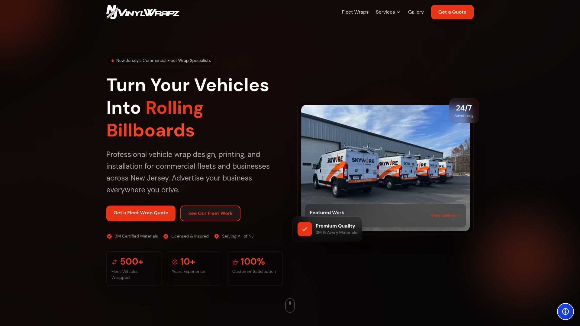
Njvinylwrapz has spent over 10 years turning commercial vehicles into high-performance brand assets for businesses across New Jersey. Every project uses premium materials from 3M and Avery, installed in climate-controlled facilities to deliver graphics that hold their color and clarity through years of daily use. Whether you operate a single branded van or a full commercial fleet, the design and installation process is built to maintain the visual consistency your brand requires. See the full range of options on the fleet wraps service page or review full vehicle wrap solutions to find the right fit for your business.
FAQ
What is the high-impact graphics definition in marketing?
High-impact graphics are visual assets designed to capture attention immediately and communicate a brand message clearly enough to drive a measurable response. The term covers any format, from digital ads to vehicle wraps, where visual performance is the primary goal.
What are the most important elements of impactful graphics?
Visual hierarchy, color contrast, original imagery, and directional cues are the four core elements. High-contrast visuals improve message readability by 47%, and directional cues guide viewer attention toward calls to action.
How do high-impact graphics benefit a business’s branding?
Consistent, high-quality visuals build brand recognition and trust over time. Companies that maintain consistent visual branding generate up to 23% more revenue than brands with inconsistent visual identities.
How do you create high-impact graphics for vehicle wraps?
Effective vehicle wrap design uses brand-consistent colors, high-contrast typography, minimal copy, and a single clear contact point. Designs must remain legible at speed and distance, which means simplicity outperforms complexity in this format.
Why does creative quality matter more than ad targeting?
Creative execution accounts for about 70% of a campaign’s effectiveness, making it the single largest performance driver. Strong visuals anticipate viewer behavior and guide attention in ways that targeting and budget alone cannot replicate.